[PT-BR] - Alimentos reais para pessoas ativas.
Fitthree é uma empresa de nutrição personalizada localizada em Singapura - Ásia que oferece alimentos saudáveis prontos para consumir, eles são personalizados para cada dieta, sabor e estilo de vida.
O "Three" no seu nome reflete os três principais macros da dieta, que são as proteínas, carboidratos e gordura, além de simbolizar as três refeições do dia (café da manhã, almoço e janta), já o "Fit" representa os produtos naturais e saudáveis que a empresa oferece. Com isso em mente, a tipografia conta com duas espessuras, com o estilo Bold no "Fit" e Regular no "Three", justamente para evidenciar essas duas palavras com importantes significados.
-
[EN] - Real food for active people.
Fitthree is a personalized nutrition company located in Singapore - Asia that offers healthy ready-to-eat foods, they are customized for every diet, taste and lifestyle.
The "Three" in their name reflects the three main macros of the diet, which are proteins, carbohydrates and fat, as well as symbolizing the three meals of the day (breakfast, lunch and dinner), while the "Fit" represents the natural and healthy products that the company offers. With this in mind, the typography has two thicknesses, with the Bold style in the "Fit" and Regular in the "Three", precisely to highlight these two words with important meanings.

[PT-BR] - Símbolo
O símbolo foi construído buscando reforçar os principais ideais da empresa. Temos a letra F, de Fit, e T, de Three, além da representação de uma planta fazendo associação aos produtos naturais e caseiros. Para finalizar, podemos ver uma pessoa de braços abertos, simbolizando a comunidade e companheirismo.
-
[EN] - Symbol
The symbol was built seeking to reinforce the company's main ideals. We have the letter F, for Fit, and T, for Three, as well as the representation of a plant making an association with natural and homemade products. To finish, we can see a person with open arms, symbolizing community and fellowship.

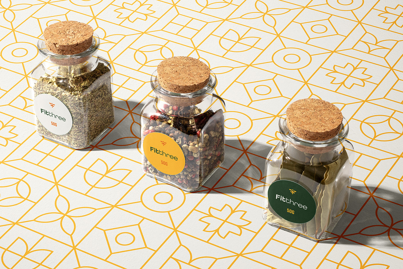
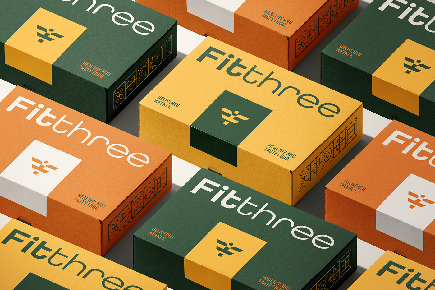
[PT-BR] - Cores
Através das cores amarelo e laranja, a paleta de cores consegue transmitir uma sensação vibrante, saborosa e energética. Já o verde remete à natureza e as folhas, trazendo associação aos produtos da empresa e as comidas naturais e saudáveis. O off white complementa muito bem a identidade visual, trazendo um toque de modernidade.
-
[EN] - Colors
Through the colors yellow and orange, the color palette can transmit a vibrant, tasty and energetic feeling. The green color refers to nature and leaves, bringing association to the company's products, natural and healthy foods. The off white complements very well the visual identity, bringing a touch of modernity.

[PT-BR] - Pattern
Para agregar mais valor a identidade visual, foi criado um pattern composto de folhas e flores, para remeter a comida saudável, caseira e tradicional. Além disso, também podemos ver algumas formas geométricas, trazendo minimalismo, modernidade e sofisticação para a marca, já as linhas diagonais e verticais que se conectam foram criadas buscando transmitir o conceito de comunidade e ligação com os clientes.
-
[EN] - Pattern
To add more value to the visual identity, a pattern composed of leaves and flowers was created to refer to healthy, homemade and traditional food. In addition, we can also see some geometric shapes, bringing minimalism, modernity and sophistication to the brand, and the diagonal and vertical lines that connect were created seeking to convey the concept of community and connection with customers.